Avenir
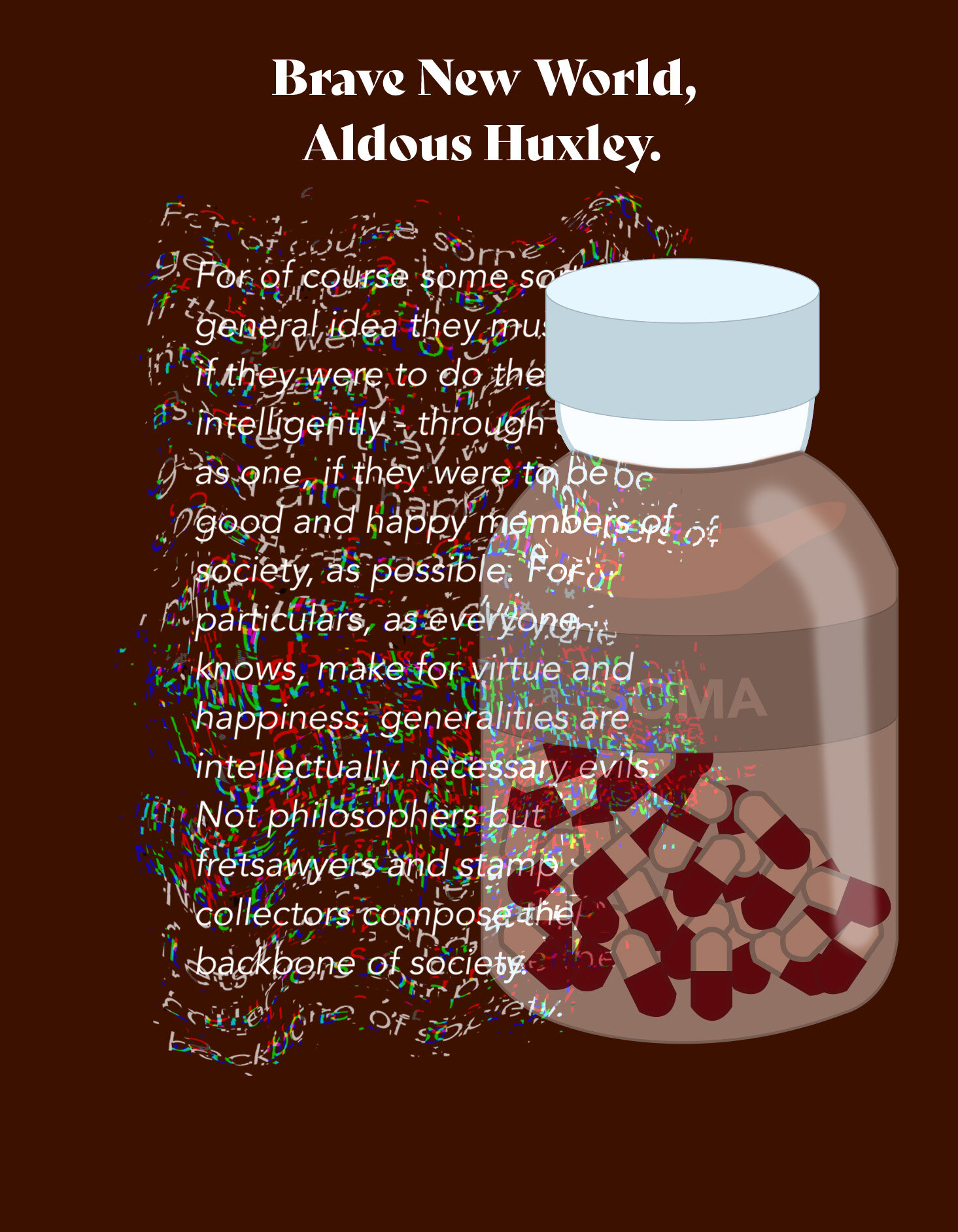
Avenir is a publication I created, inspired by the font of the same name. It reflects on different dystopian futures depicted by different authors and film makers, to show warnings of a future we in the present would want to avoid. These futures are presented in one complete timeline, in chronological order to the time setting from each work of fiction. For example, the novel 1984 by George Orwell would be dated as 1984, as opposed to the publication date of 1949.
Problem
This brief required a printed publication of any format, inspired by and using a font from a precise selection. I chose the font Avenir, which I later found can translate to the future, or time to come.
Solution
Inspired by the meaning of my chosen font, I wanted to explore our previous understandings of what the future could have looked like. I also wanted to push different printing formats, and so rather than a more straightforward perfect bind, I decided to use a concertina fold. The ability to fold out into a single line helped to push the timeline narrative of the publication.


Expansion.
After the publication was printed, I decided I wanted to try and push the type further, as the type was the central focus of the publication.
I created four more pages, using two of the novels, to try and push the type even further into a more experimental and less legible form.